Calm Canvas for the Bedroom — Quiet Wall Art for Couples
Guide to choosing soothing canvas prints for your bedroom. Colours, sizing, and photo styles that help you sleep better.
Bedroom · Styling
The bedroom is the one room you retreat to at the end of the day, the one place that shouldn't demand anything of you. The light is soft, the air is still, and if you're lucky, the walls hold nothing but quiet — a few favourite objects, clear surfaces, and perhaps a single image that makes you pause instead of think. A well-chosen canvas in a bedroom doesn't announce itself. It sits there in the morning light, in the half-dark before sleep, asking nothing except to be looked at. This is how a room becomes restful: through restraint, through colour, through the kind of image that doesn't compete with the rhythm of your days.
By the Photumo team · 28 April 2026
What belongs on a bedroom wall
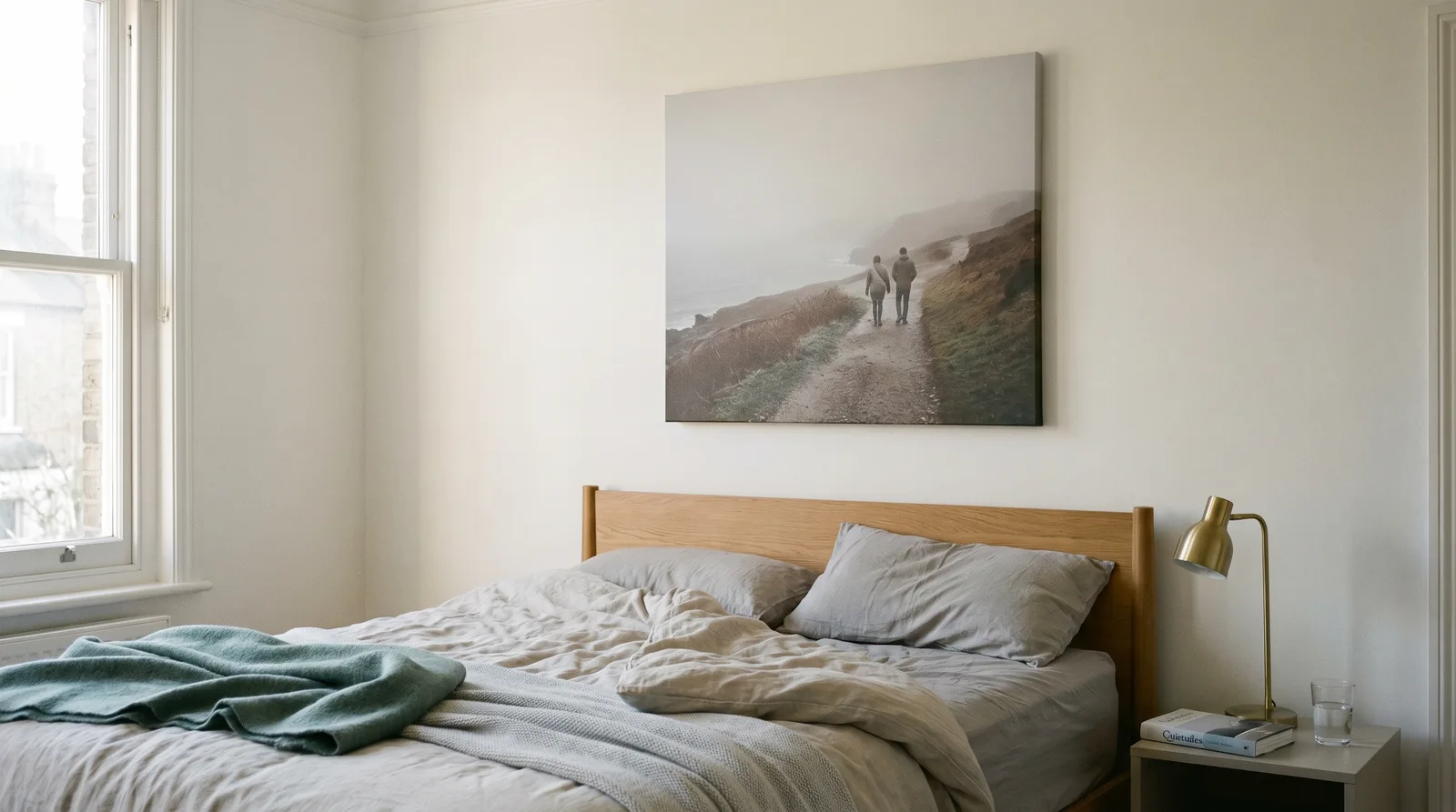
Not every photograph suits a bedroom. The images that work best in this space tend to share certain qualities: they're calm, they're uncluttered, and they ask very little of your attention. A couple sitting on a quiet beach at dusk, a snowy forest with minimal contrast, an abstract landscape in muted tones — these read as restful. A busy market scene, a crowded street, a high-energy travel moment, or an emotionally charged portrait do not. They belong elsewhere.
Think about how you want to feel in the moments you spend in your bedroom: waking, dressing, preparing for sleep. The art on your walls is part of that mood. If you hang a canvas that excites you or demands interpretation, you've created friction in a room designed for ease. Instead, choose images that let your mind settle. Couples naturally gravitate toward candid moments together or solitary landscapes that feel contemplative. If you have travel photos, ask yourself: is this the image I want to sit with during the quiet moments, or is it the one that makes me want to start planning the next trip? The difference matters.
Colour and light — the quiet palette
Bedrooms in the UK benefit from soft, desaturated colour. Our light is often overcast, cool, and low — there's rarely the strong sun you'd find in southern climates. Canvas prints look different in British light than they do in photographs on a screen. A colour that reads as vibrant on your phone may look muted on canvas in a grey afternoon. This is actually an advantage. Soft greys, warm whites, pale ochres, muted sea-greens, and off-white tones all settle into bedroom walls without fatigue. The image becomes part of the room's atmosphere rather than a focal point demanding attention.
| Colour palette | Mood | Room pairing |
|---|---|---|
| Soft grey, charcoal, taupe | Grounded, calm, introspective | White or cream walls; natural wood headboard |
| Warm white, cream, ivory | Light, restful, minimal | Pale walls; soft linen bedding |
| Pale ochre, warm sand, terracotta (muted) | Warm, earthy, grounding | Off-white walls; natural fibres |
| Muted sea-green, sage, dusty blue | Peaceful, meditative, cool | Neutral walls; possibly paired with a second muted tone |
The goal is colour harmony that doesn't read as flat or boring. If your walls are white, you might pair them with a canvas featuring muted grey and ochre tones. If your walls are a very soft green, echo that in your canvas without matching it exactly — introduce a complementary grey or warm tone. The canvas and the room should feel like they were designed together, but subtly.
Photo selection — what light means
The quality of light in your photograph matters more than subject matter. An overcast afternoon in England, a misty morning, a snowy landscape, the golden hour in a quiet garden — these light conditions translate well to canvas. Harsh midday sun, bright blue skies, and strong contrasts often feel jarring in a bedroom context. Look for images where the light is diffuse, the shadows are soft, and no single element dominates the frame.
Research from the Sleep Council UK suggests that calming visual environments improve sleep quality and contribute to a sense of wellbeing. The images that support this are those with low visual complexity and soft, cool colour temperatures — exactly the qualities we've been discussing. When choosing between two photographs for your bedroom canvas, ask yourself which one your eye can rest on. The answer is usually the quieter image.
Sizing and placement — above the headboard
Canvas sizing above a bed isn't arbitrary. A small canvas on a large wall reads as uncertain; an oversized canvas on a small wall feels claustrophobic. The proportion should feel intentional.
| Bed size | Recommended canvas | Visual effect |
|---|---|---|
| Single | 30 × 40 cm or 40 × 50 cm | Intimate, focused, minimal visual weight |
| Double | 40 × 50 cm or 50 × 75 cm | Balanced, present but not dominating |
| King-size | 60 × 90 cm or triptych (3 × 30 × 40 cm) | Anchored, gallery-like, substantial presence |
A single large canvas creates visual weight and makes a clear statement. A triptych — three panels hung 10–15 cm apart — feels lighter, more collected, and allows visual breathing room. Both approaches are elegant. The choice depends on your wall height, your aesthetic preference, and the proportions of your bed and room. Aim to hang the canvas so it aligns visually with the headboard, leaving 10–15 cm of clear wall above it (or below, if the canvas sits lower). The canvas should feel anchored, not floating.
How to order your canvas in 7 steps
-
Choose your photo. Start with an image that feels calm to you — a moment when the light was soft, the scene uncluttered, and your eye rested. Landscape photos work well, as do candid couple portraits in natural light. Avoid busy backgrounds or emotionally intense moments. The photo doesn't need to be recent; older travel shots often have the quiet quality bedrooms need.
-
Check the colour palette. Look at your photograph's dominant colours. Do they match the calming palette you want — soft greys, ochres, sea-greens, off-whites? If the image feels vibrant or saturated, consider whether it's the right tone for a bedroom. Canvas printing doesn't change colour much, so choose images that already feel restful.
-
Measure your wall space. Above a headboard or on the wall opposite the bed, measure the space where the canvas will hang. For a king-size bed, a 60 × 90 cm canvas works well. Measure in both centimetres and inches so you know your options. Remember to leave clearance from the headboard or furniture — typically 10–15 cm.
-
Decide on single or triptych. Visualise whether a single large canvas or three panels suit your room. A single piece feels anchored and bold; a triptych feels lighter and more gallery-like. Both are equally elegant — it's about the proportions of your wall and your preference.
-
Upload your photo and select size. Head to Photumo and upload your image. Choose your canvas size (30 × 40 cm up to 60 × 90 cm for most bedrooms) and decide if you want one canvas or a triptych set. The site will show you a preview of how your photo looks on canvas in your selected dimensions.
-
Review production and shipping details. Photumo's hand-stretched cotton canvas is made to order. Production takes 3–5 working days, and UK shipping is 2–3 working days. You'll receive your canvas ready to hang — no framing needed.
-
Hang and adjust. Once it arrives, hang the canvas on the wall where you've planned. Step back and live with it for a day or two. Bedroom art should feel restful at all hours — morning light, afternoon, bedtime. If it feels right, you've chosen well.
Frequently asked questions
What canvas print size works best above a king-size bed?
A 60 × 90 cm (24 × 36 inch) canvas or a triptych of three 30 × 40 cm panels work well above a king-size bed. The 60 × 90 cm single piece gives weight and presence without overwhelming the wall, whilst a triptych creates a softer, more collected feel. Above a headboard, aim for the canvas to span about two-thirds of the bed width — this proportional relationship feels balanced and intentional.
What colours and styles help you feel calm and relaxed?
Soft, desaturated tones work best: warm greys, pale ochres, muted sea-greens, and off-whites. Images that read as quiet — overcast landscapes, abstract gentle forms, couples or solitary figures in soft light, low-contrast travel moments — feel more restful than busy, colourful, or emotionally charged imagery. The key is restraint: photos that don't demand attention when you're waking up or falling asleep.
Best way to display family or couple photos on a wall without looking tacky?
Choose a single, well-composed image over small collages. If it's a couple photo, select a candid moment in soft natural light rather than a formal portrait. Keep the background simple and uncluttered — a beach, a forest, a quiet street. Frame the canvas in the room's broader aesthetic: pair it with natural textures (linen, wood, plaster) and neutral wall paint. One thoughtfully chosen image, given its own wall space, reads as curated and intentional, not sentimental.
Should I hang one large canvas or a triptych above the bed?
It depends on your bed size and wall height. A single large canvas (60 × 90 cm or bigger) suits bedrooms with high walls and spacious headboards — it creates a focal point and feels anchored. A triptych (three 30 × 40 cm panels, 10–15 cm apart) feels lighter and more flexible, working well in rooms with lower ceilings or narrower walls. Both are equally valid; choose based on your room's proportions and your personal preference for visual weight.
Are travel photos appropriate for the bedroom or only the living room?
Travel photos work beautifully in bedrooms if they're quiet and meditative — a misty morning in Kyoto, an empty beach at dawn, a snowy landscape. They become a place to rest your mind rather than remind you of adventure. Busy market scenes, crowded landmarks, or high-energy travel moments belong in the living room or hallway. In the bedroom, choose the image that makes you want to pause, not plan.
What's the right colour palette for a calming bedroom canvas?
Restrict yourself to three dominant tones in the image and room together. Soft greys paired with warm white walls, pale ochre with cream, muted green with off-white — these combinations feel cohesive without being monotonous. Avoid primary colours, high saturation, and strong contrasts. Test how the canvas looks in morning and evening light; cool overcast light in British homes suits cool greys and sea-greens, whilst golden afternoon light flatters warmer ochres and muted terracottas.
Related guides
- Couple anniversary canvas — marking moments together — Choosing photographs that celebrate your relationship without sentimentality.
- Gallery wall guide — how to arrange multiple canvas prints — Designing an intentional wall of images that feels cohesive.
- Canvas sizing for every room — a complete guide — Proportions and placement for hallways, living rooms, and bedrooms.
- How to choose the right photo for canvas — Technical and aesthetic considerations for print quality.
- Travel canvas prints — bringing home quiet moments — Selecting travel photographs that work on walls.
- Canvas art for home decor — the complete styling guide — Integrating canvas prints into your interior aesthetic.